Car buyers judge fast. In the first seconds on your website, a first impression forms that decides whether they stay or leave. Win that moment and you have already won half the sale.
This guide shows what visitors notice first and how to use that moment. It is about the area at the very top, about speed and about clear messages. Step by step, you turn a quick glance into a real contact.
Why a first impression decides online
Nobody reads a strange page patiently from top to bottom. A first impression forms in a fraction of a second, long before anyone thinks consciously. If the page feels unclear, the visitor is already gone.
Research shows how early this judgment falls. Gitte Lindgaard found around 50 milliseconds for the visual impression. That is how short your window is to convince.
What buyers see first
The top of the page decides a lot. The visitor takes in a large image, a short message and maybe a button first. These three things shape the impression.
The area at the top
The visible area without scrolling is your stage. The most important thing belongs here, not an empty decorative picture. Say at once who you are and what the visitor will find.
The speed
A slow page ruins any good start. If the top image loads too late, the visitor is already gone. Speed is not a detail, it is part of the effect.
A clear headline that works at once
Your main headline is the first sentence everyone reads. It should say in a few words what the visitor gets from you. Empty slogans waste this valuable space.
Write concrete, not general. Used cars with warranty in your area says more than a warm welcome. That way a good first impression supports your whole page.
One strong image at the top
The first image carries half the effect. Show a real, well lit car instead of a random stock symbol. An honest photo feels more trustworthy than any graphic.
Avoid crowded slideshows. A calm, sharp image loads fast and does not distract. That keeps the eye where it belongs.
How to improve the first impression first
If time is short, take care of the top area first. Make sure of fast loading, a clear headline and a real car photo. That makes your first impression better the fastest.
A clear next step
The visitor should know at once what to do. A clearly visible button to the cars or to contact belongs at the top. Anyone who has to search is more likely to leave.
Offer only one important step, not ten. Too many choices freeze the decision. That way a first impression stays clear and positive.
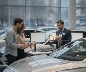
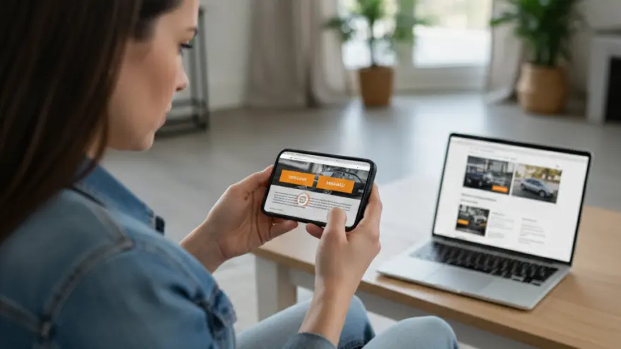
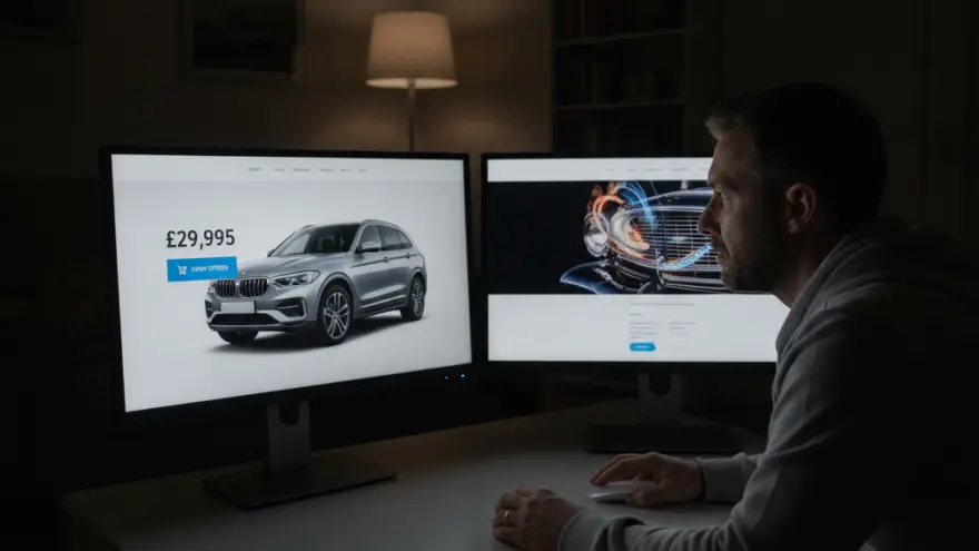
Show prices and stock fast
Many visitors look for prices and available cars first. Do not hide them behind long paths. People who find what they want fast tend to stay.
A short path to your stock shows openness. It removes the first hurdle and creates clarity. That builds a first impression of honesty.
Mobile shapes a first impression
Most people open your page on a phone first. There everything is decided on a small screen. What looks nice on a computer can feel crowded on mobile.
Test your home page on your own phone. Watch for large buttons and easy to read text. What feels sluggish to you annoys every visitor.
Speed is part of every good start
Speed is invisible but felt. Every extra second of load time costs visitors. A fast page looks more professional at once.
Compress images and avoid unneeded scripts. Even small steps bring noticeable speed. Your first impression benefits directly from that.
Trust in the first screen
A sign of credibility belongs at the top too. A review, a known seal or a clear phone number works at once. That way the visitor feels safe from the start.
Even a single honest signal supports a good start. Safety is a quiet salesperson. It works before the first word is spoken.
A clear navigation
The visitor wants to find their way at once. A simple menu with a few clear items is enough. Anyone who gets lost loses patience fast.
Name the items the way customers think. Cars, service and contact are clearer than creative terms. Clarity beats originality here.
Keep the top area simple
Too much at once overloads the eye. A calm top area with one clear message works better. Less is almost always more here.
Leave room in the layout on purpose. A calm image guides the eye. That keeps a first impression pleasant and clear.
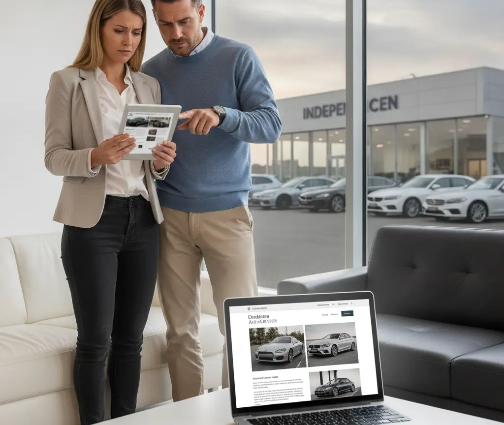
Match the message to your ads
Someone who arrives from an ad expects the same promise at the top. If the home page does not match, confusion appears at once. Keep the ad and the page close together.
A consistent promise feels reliable. The visitor feels they have arrived in the right place. That strengthens every good start.
Make search easy to find
Many visitors want to find a specific model at once. A clearly visible search box belongs at the top. People who search fast tend to stay on the page.
Offer simple filters by price, brand and mileage. That way everyone finds the right car quickly. Easy search strengthens the whole first impression.
Show location and opening hours
Buyers want to know where you are and when you are open. Show your address and hours clearly. This small clarity removes an early uncertainty.
A map and clear directions help as well. Anyone who knows the way plans the visit more easily. That turns interest into an appointment faster.
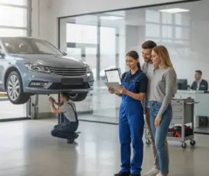
Show real photos of your dealership
A real photo of your place feels more trustworthy than any stock symbol. Show your location and your team from their honest side. That makes the unfamiliar feel familiar.
Stay natural and honest about it. No glossy polish, just a real picture. That alone feels likeable and credible.
Avoid pop-ups that block the view
Nothing ruins the first glance faster than a pop-up. Anyone who must close a window at once gets annoyed fast. Keep the top area free of them.
Offer hints quietly and later instead. That keeps the important first moment undisturbed. Calm works stronger than any campaign here.
Test with real visitors
You know your own page too well. Ask a few people outside your team to open it cold. Their first reaction tells you more than any guess.
Watch where they hesitate or get lost. Fix those points first. Real feedback beats opinion every time.
A calm, consistent look
Colours, font and logo should match everywhere. A consistent look feels professional and calm at once. A wild mix raises doubts about your care.
Choose a few colours and one readable font. Keep them across the whole site. That way the good impression holds from top to bottom.
Make the phone number easy to tap
Many buyers prefer a quick call to writing. A clearly visible phone number belongs at the top. On a phone it should dial with a single tap.
Say when you are reachable too. A clear note removes the fear of calling. That turns a first glance into a conversation fast.
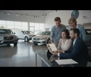
Two short examples
A buyer opens two dealerships in the evening. One shows a clear car, a price and a button at the top. The other only a decorative picture. He stays with the first.
A second visitor looks for a family car fast on a phone. The fast, clear page wins his enquiry. The slow one loses him after a few seconds.
Common mistakes
The most common mistake is an empty decorative image at the very top. Long load times and hidden prices also cost the good start. Each of these sends visitors to a rival.
Another mistake is too many buttons and texts. Too much at once overwhelms the eye. A calm first impression works stronger.
What it costs
A better first impression costs attention above all, not much money. A clear headline and a good photo are made quickly. The effort usually pays off at once.
Think in tiers. The first step is cheap and fast. Anyone who wants more can have the top area redesigned professionally later.
A look at 2026
People’s attention is getting shorter, not longer. A clear first impression becomes even more important because of that. AI assisted search also tends to favour clear and fast pages.
Your own, well built content stays valuable. Whoever convinces at the top is more independent of outside platforms. That pays off in the long run.
When it is worth it
This path is worth it for almost every dealership. Anyone with many visitors but few enquiries gains fast. Often only clarity at the top is missing.
How to start
Look at your home page with fresh eyes. Check the image, headline, button and speed at the very top. Even small changes improve the start noticeably.
Then build on it. Why mobile buyers judge so fast, the post shows, why mobile buyers often decide before they visit. How to build trust online, you can read, how to earn trust before the first test drive. And what a modern site must do, shows what a modern dealership website needs today.
For 2026 the rule is simple. Whoever is clear and fast at the top wins. That turns a good start into a real contact.
Sources
- Lindgaard et al. (2006), Behaviour and Information Technology, study on the visual first impression of websites within about 50 milliseconds.
- Nielsen Norman Group, analysis of how early visitors decide to stay or leave.
Frequently Asked Questions
How fast does a first impression form online?
Very fast. Studies point to around 50 milliseconds for the visual impression. In that short time it is often decided whether a visitor stays or leaves your page again.
What does a visitor see first on my site?
The area at the very top without scrolling. A large image, the main headline and a clear button stand out first. These three elements shape the impression the most.
How do I improve the first impression the fastest?
Take care of the top area first. Fast loading, a clear headline and a real car photo work at once. These three steps alone make a big difference.
How important is page speed here?
Very. If the top image loads too slowly, the visitor is often already gone. Speed is not a technical detail, it is a fixed part of the first impression.
Should the price be visible right at the top?
A fast path to prices and stock helps a lot. Many visitors look for exactly that. If you do not have to hide them, you look open and honest from the start.
How important is the mobile view?
Crucial. Most people open your page on a phone first. Watch for large buttons, easy to read text and a fast top image on small screens.
What does a better first impression cost?
Mostly attention, not much money. A clear headline and a good photo are made quickly. Anyone who wants more can have the top area redesigned professionally later.
Is this worth it for a small dealership?
Especially then. Anyone with many visitors but few enquiries gains fast. Often only clarity at the top is missing, and that is easy to create.